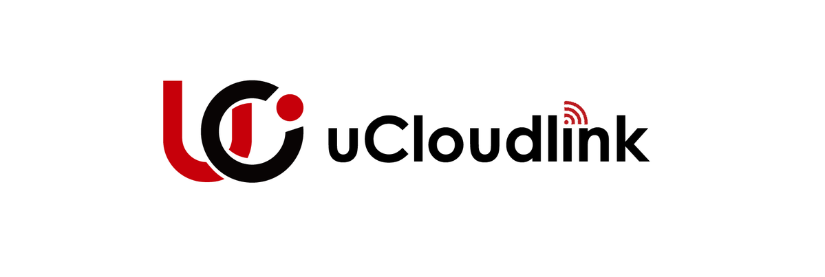
New Logo Announcement: Introducing uCloudlink new brand identity
2017-05-17 15:38:47
New Logo Announcement: Introducing uCloudlink new brand identity
We
are proud to announce the launch of the new company logo as part of the ongoing
evolution of our company’s brand.
Our
business has grown and evolved over the last 12 years, and we felt it was time
for a change. We have refreshed our logo to reflect who we are today and to
symbolize our dynamic future. This wasn’t a decision we made lightly. We are
proud of our rich history. That’s why our new logo retains core elements,
including the U outline.

At
first glance, “U” and “C” stand for the first two initial letters of the
company and they are cleverly interlocked with each other so that either left
or right part of “U” forms the letter “L”, representing the company.
Take
a closer look. The small red dot and the letter “C” subtly forms the letter
“g”; “U and “C” together is also like an abstract “m”. The “g” and “m”
,together with “u-your”, implying that we commit to making global mobility
within reach. uCloudlink’s products and services cover 100+ countries or regions.
Actually
the “C” contains more meaning than its shape indicates. It stands for “
customer (user)”, “corporate”, and “ carrier”, who we will support with three
professional business units providing creative, customized and localized
services.
In
the upcoming days till May30th we have to update all our collaterals, marketing
literature, online presence, stationery, etc with the new logo. We are aware
that changing a logo is a process that can involve many steps and take some
time, so we will finalize it gradually. We recommend you using existing
material while stocks last.
If
you have used the uCloudlink logo in any of your marketing materials, please
assist us in updating them. We appreciate your kind support and invite you to
contact our marketing department for getting the new artwork.
Regards,
Zhu Tan
Chief Marketing Officer
uCloudlink Group
